Exercise 3 - A limited Palette Study
Although the exercise says to develop one of the sketches from the previous exercise, because I’d strayed a little from the brief, I thought it best not to. Again, I wanted to draw from life rather than from a reference photo, so back to the window. This time I used the window in my studio space which, as luck would have it, is quite varied and interesting. There are strong man-made structures which are framed by wild looking plants and trees. For this piece I decided to use Conte pencils and charcoal. I selected sepia, sanguine, black, and white charcoal. I’ve had these pencils in my collection for a long time, but this was the first time I’d really experimented with this very traditional palette. I also selected a toned paper rather than white, I felt having a ground to work on, that was sympathetic to the palette, would help the drawing unify.

This drawing is successful in fulfilling the brief, while at the same time not being the best piece of art. I think I’ve successfully managed to create some depth in the image. I could have been braver with the tonal range in places. The lack of any significant black point leaves it feeling lacking somehow. The balance between detail and abstraction also doesn’t work as intended, the bushes and trees are over abstracted in relation to the very sharp details of the building on the left.
Exercise 4 - Statues
For this exercise I selected two statues that are local to me. Both are very different both in style and presentation, they are indicative of the time and political environment they where erected in. The first statue is situated outside the National Union of Miners headquarters in Barnsley. It depicts a miner, his wife, and their children. It was sculpted by Graham Ibbeson and erected in 1993. It carries the inscription “In memory of those who have lost their lives in supporting their union in times of struggle” This is horribly sad piece of sculpture, the figures are depicted as downtrodden, weary souls. That being said there is also stoicism evident, it screams ‘we may be poor but we will not be beaten’. The statue itself is set on a low plinth allowing you almost look directly into the eyes of the subjects.
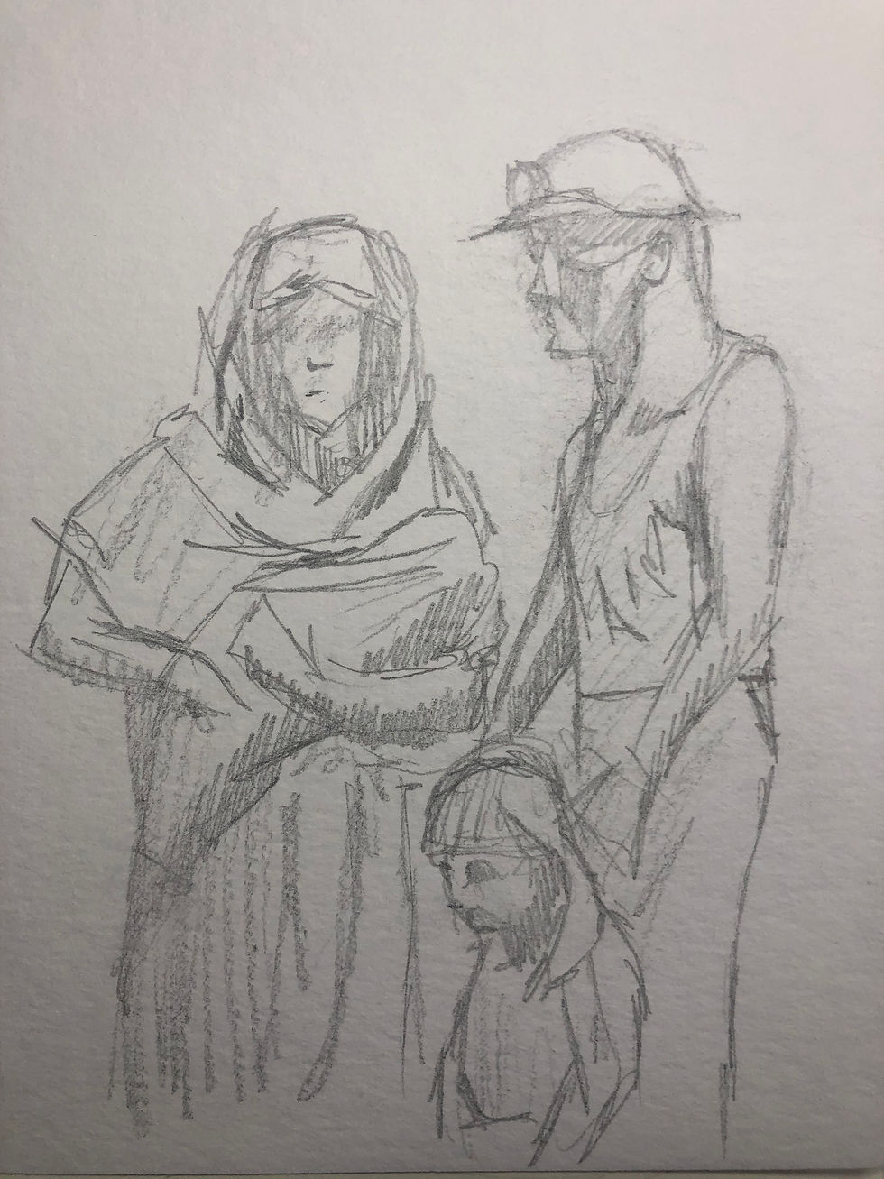

These sketches don’t do justice to the statue but it was enjoyable to re-engage with figure drawing after so long drawing trees.
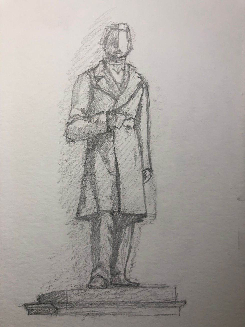
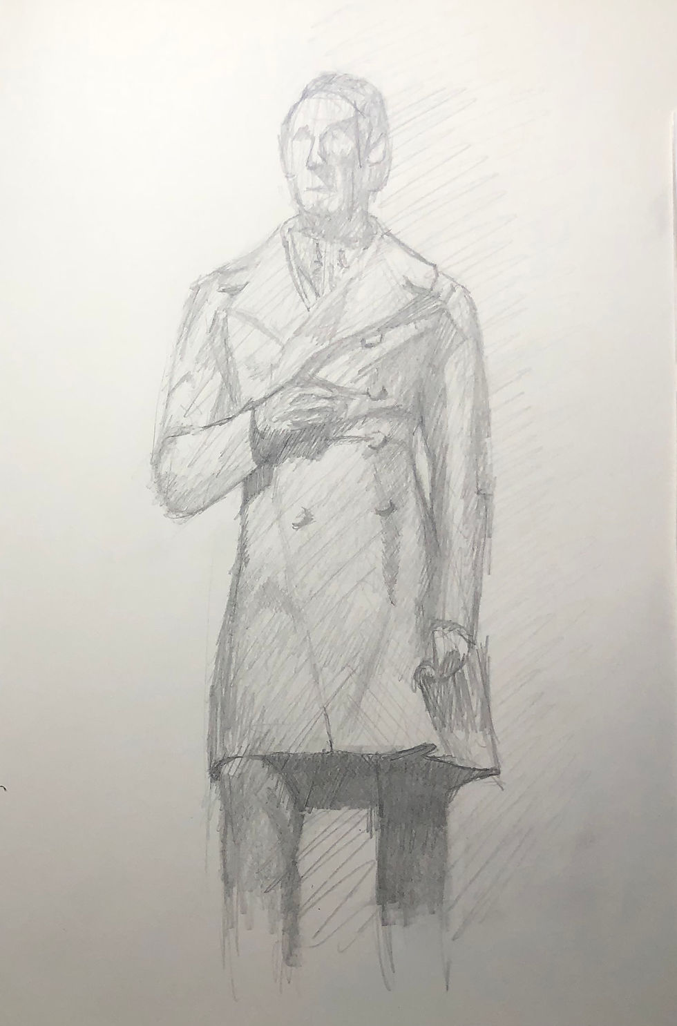
The second statue I chose was the bronze statue of 19th century railway engineer, Joseph Locke. The park in which it sits was gifted to the town by the Locke family after his death, the statue was raised and dedicated to him by his widow in 1866. It was sculpted by Italian-French artist Charles Marochetti. In complete contrast to my first selection. this statue is a demonstration of wealth and achievement. The figure is posed in such a way as to infer this man took care of business. It’s a powerful pose, which is heightened by being placed on a high plinth and encircled by a stone facade. You are forced to look at up at the statue from a reverential distance.
These drawings are ok, I continue to feel an eagerness to draw people again. The closer up one of the two, comes closer to hinting at the “power” on display. I look forward to exploring the human form much more in the coming months.
Happy Scribbling
Comments