After my experiments in the previous exercise with colour, and the things I’d learned while experimenting with line, I thought this task was the perfect chance to combine these ideas. I began by selecting a subject and doing a number of studies in various materials. This was done firstly to try and solidify in my mind which medium I would produce the finished drawing in, and also to experiment with composition.

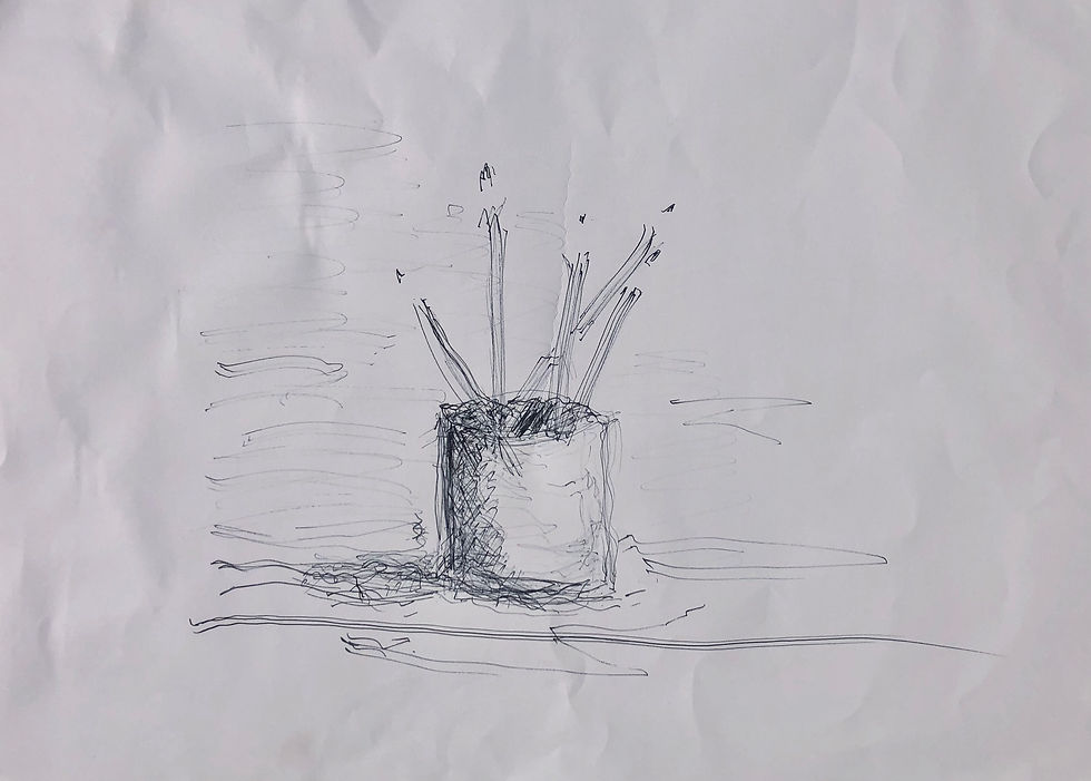
Initially, I did this quick rough pencil sketch. This allowed me to begin to understand the form and roughly work through blocking out the shapes. Doing this gave me the idea that I wanted to try and make the final work somewhat abstract.
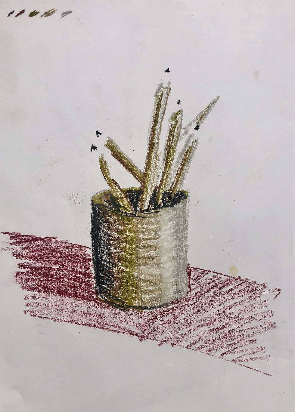
Next, using some big unwieldy block of coloured charcoal, I produced this study. I fear I strayed back to representationism a bit in parts, but I did like my use of line when drawing the pencils. I would remember this going forward.
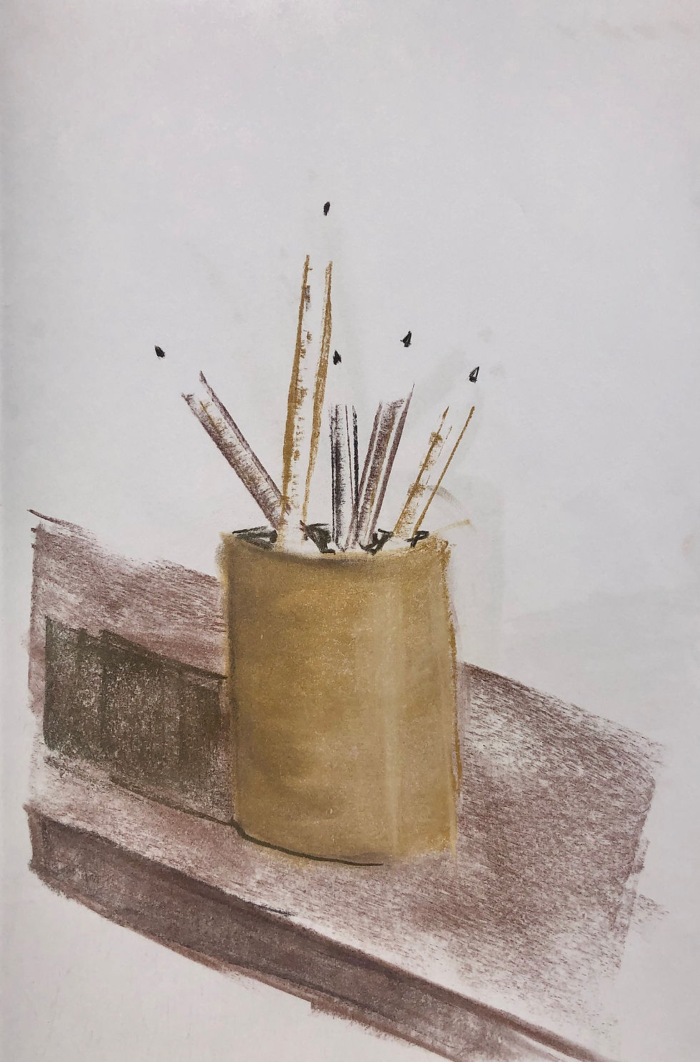
This was the next study drawing I produced. Using oil pastels, I tried to be freer using a limited colour palette to represent variations in tonal value. Again, I tried to work fast and not get bogged down in details. The rendering of the pot in this one was the part I liked and it help me continue to develop my ideas for the final piece. The scratchy lines and the way colours transitioned into each other was something I liked and would develop in the next drawing.
Up until this point, I hadn’t really concerned myself with the mixed media aspect of the exercise. I felt that working through my ideas, in mediums I was comfortable with, would prove the most profitable. I didn’t want to get distracted by unfamiliar, weird tools when I need to work out the fundamentals of the drawing first. I would now need to give some thought to how I would execute the drawing.
Before doing so though, I had an idea for a different drawing tool that might prove interesting. This was my next experiment, I taped together three bamboo kitchen sticks. I arranged them on an angle like a wedge so, dependant on what angle I held them, there would be a variety of marks. This was almost impossible to control and was really messy to use. The sticks worked like straws, sucking ink further and further up until I was covered, practically more ink than man. That being said, the sketch did put me on to the idea of using a pen. But what kind of pen? What kind of pen would allow me to produce interesting marks? Vary tone through the use of a limited colour palette, while also fitting the mixed media brief?
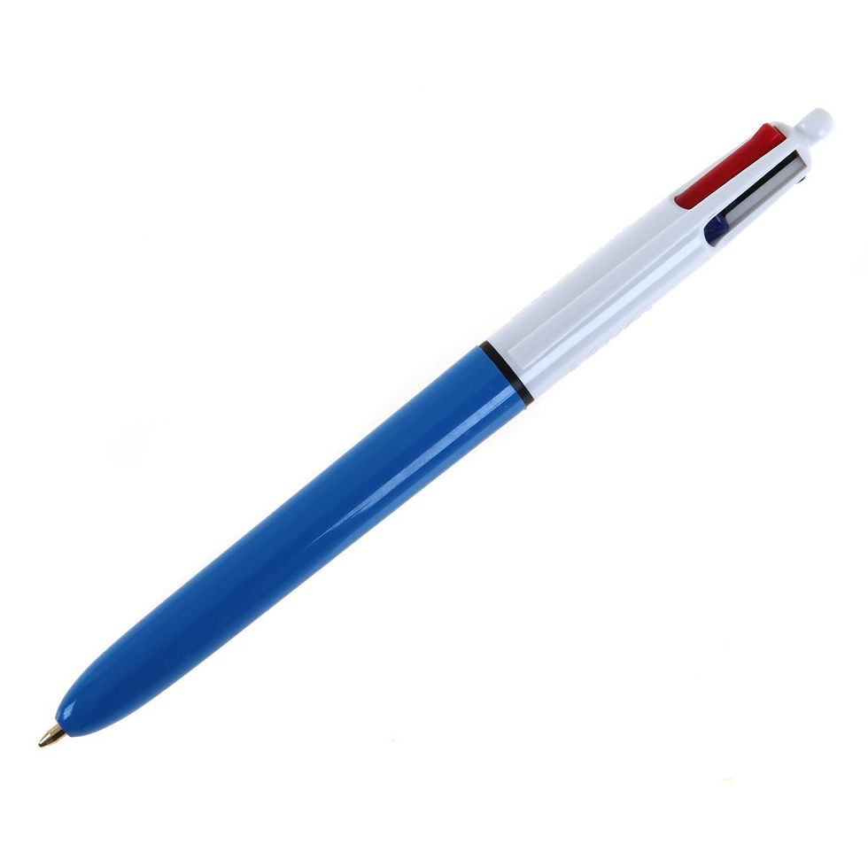
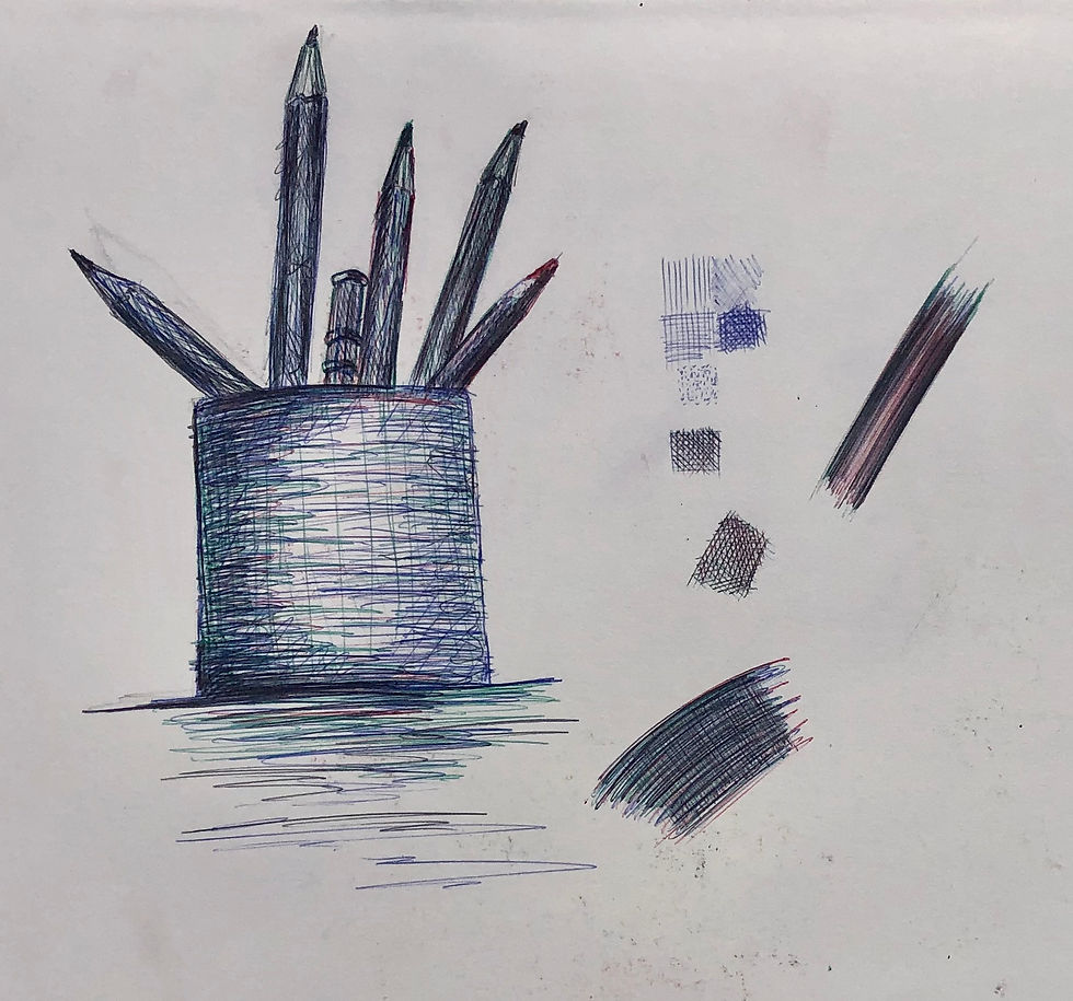
You guessed it: the glorious, undisputed heavyweight champion of my school room pencil case. The Bic 4 colour ball point pen. Not only did it have a variety of colours I could use to create tone, but because of its design and functionality, it would allow me to get creative with the surface I could work on. I did some swatching and testing in my sketch book, layering the colours together to see what could be achieved. Finally doing a sketch of my subject with the tool. Excellent, I thought, this could be really cool. But an artist can not live by pen alone — I needed “paper”.
This is where I thought I could have some real fun. I discounted anything from my paper stash as too conventional and boring. I decided that I would make a surface myself that would complement the subject of the drawing. I acquired a large sheet of white single walled cardboard, the kind of thing boxes are made of. This would be strong enough to take whatever abuse I could throw at it, while imparting it’s slightly wavy texture to anything I added on top. I did a few experiments drawing directly onto this surface but was dissatisfied with the results. I would need to build on the base before I could begin drawing. Luckily, that morning through the letter box, there had dropped an art supply catalogue. The inner child had a thought. The inner child that had watched every episode of Art Attack. The inner child who watched Blue Peter only to be disappointed when an episode didn’t involve PVA and sticky backed plastic. I ripped up the catalogue into irregular strips with glee and ran for the PVA glue. Arranging the strips to form an internal frame on the cardboard, I began building a textured surface more resilient than the cardboard alone. Now, it occurred to me that this was going to make it extremely difficult, nah, impossible to draw directly on to the surface. For one thing, the printed pages would overwhelm anything I drew on top. I had no idea what to do. Should I fine something to stick over the top to draw on? No, that wouldn’t work. I was stumped, but determined to find a solution that I liked, I resorted to that age old British tradition when a thorny problem presents itself — I put the kettle on and had a nice cup of tea. Sipping away at the steaming hot mug, I flicked on the YouTubes and was browsing around the various art channels I subscribe to. I ended up watching a video tutorial by portrait painter, Caesar Santos, where he explained how he prepares pages in his sketchbook so he can paint directly into the book in oil. I learnt a new word right there and then — gesso. OK, I thought, that could work but where could I get some gesso on a Sunday afternoon? To cut a long story short, I couldn’t get any for at least a few days. That wouldn’t do at all. Back to the internet, I went.
I found a recipe and looked down the list of ingredients. PVA glue, check. Acrylic paint, check. Talcum powder, check. Water, check. This was happening. I was making my own gesso. After following the recipe and mixing up a batch, I began applying it to my work. I built up a few layers, allowing it to dry in between, until I had a white surface I could work with, taking care not to completely obliterate the catalogue pages completely. Once everything had totally dried I gave the surface a light sanding, hoping this would allow the pen to flow reasonably well across it.
This is where the wheels came off, so to speak. Nothing in my experience, which sadly now includes a global pandemic, can really compare to a good old global pandemic in order to completely derail any project. The prepared surface sat untouched for a few weeks while the world descended into terrifying chaos. When I finally managed to get the thing back up on the easel, there had been plenty of time to think through my plan of attack for the next stages, but I had really only given it passing thought. Most of that time had been spent dealing with the same crippling anxiety and feelings of impending doom which were flooding through the rest of the world, along with processing the rapid changes which were being imposed on our hither to taken for granted social freedoms.
In the end, I knew it was work, creativity, and maintaining some sense of structure, that was going to keep me sane. From childhood, right from the nursery, most of us are placed within a system of routine and structure through which we understand, relate, and function in the world. The institutionalisation of education followed by the 9 to 5 working grind. It's a very strange experience at the age of forty to have that lifted off. There was a strong inclination to binge watch, to sleep late, stay up late,……blah blah. But experience tells me where that ends: self loathing, more anxiety. We have to believe that this pandemic will end, which means that there will be a day when furlough will end and there will be return to, maybe not normal, but that strange new buzz word ‘the new normal’. If I didn’t want to enter into that with self loathing, guilt for time-wasting, for not grasping at the one opportunity for something worthwhile to come out of this truly horrible time, then I had to get back to work. It wasn’t easy, particularly at first, and there were times when getting the brain to work felt like wading through sludge. But as i’m not a key worker, still have the gift of my health, the health of those I love, coupled with a modicum of financial security, plus a garden for god’s sake, then i’m really not in a position to be whinging about my situation. I put the picture back on the easel and started to reconnect with it.
I felt I had a really interesting base to work from, and reviewing my test drawing, I still thought the subject would look good drawn in the biro. But the background — that would need to be dealt with first — the subject would need to rest somewhere. This is where I thought technology would be a great asset. I took a photo of the black canvas and used the digital drawing app, Procreate, to test out ideas. I came to the conclusion that I wanted the background to be simple areas of colour, allowing the drawing to pop out from its surroundings. Sketching out the areas where my final drawing would sit, I used masking fluid to protect these areas for later. Thinning out some acrylic inks with water, I used them to cover the canvas. I created a horizontal plane with two different colours to represent a table top for my subject to rest on. Once this had all dried, I peeled away the masking and erased my sketch. I set up my subject items in view and lit them with a bright lamp. During my tests with the pen, I concluded that if I worked with one colour at a time, in the right order, I could create the impression of changing tonal values. Red first, followed by green, followed by blue, only resorting to black for the very darkest of shadows.


All in all, this piece turned out considerably better than I expected. All the prep work feels to me like it contributed to the look of the final piece. I learnt some excellent lessons about resourcefulness and perseverance. I really enjoyed producing this piece of work which feels very far out of my comfort zone. I wouldn’t have even begun to put this kind of thing together if it wasn’t a course mandated task. A valuable exercise for me and one I will learn lessons from about what I consider ‘my art’. And the beat goes on, so say The Whispers in their 80s anthem, and so will I. Not as quickly as I would have done or would like to in the ‘before’ times. But I’m keeping th’ead darn and carryin’ on.
Happy scribbling…
Comments