My plan of attack for this project is going to be a bit different from the previous projects. Having had a read through the brief, it feels to me more like one big exercise, rather than a selection of disparate tasks. Each exercise building upon the last, using each to develop and inform the final assignment piece. With this in mind, I will combine my thoughts in a single blog, rather than posting a little bit here and a little bit there.
Exercise 1 - Quick Sketches around the house.
Drawing your surroundings is and has always been a mainstay of artist practice. When I don’t have any idea of what to draw next, when the big scary blank white page is staring at me, and I’m at the point of putting everything away and giving up, this is the time I just draw what I see. So I was quite comfortable with this. I decided that I would try and do a couple of drawings each day, switching up materials and view point as I went on.


As you can see in the images I produced, I concentrated my efforts on the living room and my office. Due to the size of our house, the other rooms are so small it proved very difficult to get more than one position to work from which meant extended study was impossible to achieve comfortably. I’d did a number in thick wedge tipped Sharpie — these were done at speed, trying hard to focus on shapes and their relationships, rather than form and tone. The remaining were done in the same way but with pencil. Having done some research online about pencil technique, I tried to use this exercise to develop my pencil control. Altering the way I hold the pencil would increase the variety of marks I could produce. I found that using an overhand grip helped produce more fluid lines, allowing me to draw from my shoulder rather than relying on wrist and fingers. Also sharpening the pencil with more lead exposed allowed more variety in line width. However, the more traditional tripod grip was better at producing finer details and smaller marks. I thought the looser pen drawing were the strongest. The speed and rough nature gave them a dynamic quality I liked. That being said, I much preferred working with pencil, the extra variety of line gave me the feeling of more control.
In the next exercise, I wanted to develop these studies and try and add some tonal information.
Exercise 2 - Composition and interior
After reviewing all the drawings I’d done in exercise one, I selected a few areas worthy of further work.
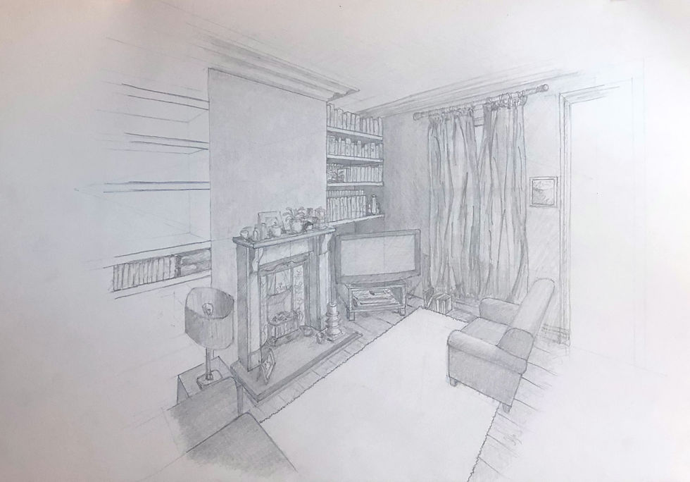
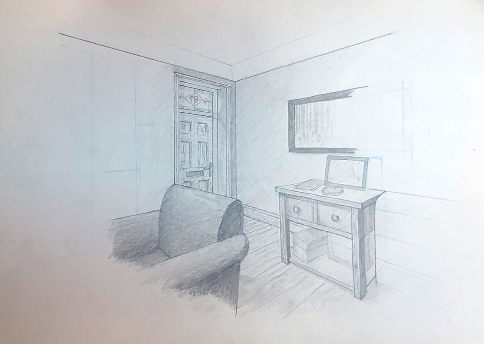
These first two images of our living room were done in pencil. I thought I would concentrate on perspective and see how that affects my outcome. Using a different coloured pencil to block out the perspective lines, I used these as a reference for the shapes and angles of the things within the scene. Unfortunately these drawings came out significantly more stilted than I would have hoped. They feel far too much like an architect’s rendering or an interior designer’s sketch. Sticking to rigidly to the perspective lines made everything feel a little unreal. I would take what I had learned and try a different scene.

This image of the coat stand and piano in our kitchen was produced using Indian Ink and a rigger brush. I thought the looseness of the brush (in my hands anyway) would be the antithesis of the tighter pencil drawings. I feel I overworked this by adding to my scratchy areas and it looked better before they were added. But my previous work on perspective did help inform they composition.

My final drawing for this exercise was done with charcoal powder and a kneaded eraser. There are some good things in this image: the suggestions of clutter, loosely rendered with very few marks pleased me. I would keep the lessons learned from these drawings in mind when progressing on to the next exercise.

Exercise 3 - Material Differences
Time for a bigger canvas. I selected to use A2 paper. I was yet to decide on a specific subject or composition, although there were a few ideas from the previous studies that peaked my interest.

This drawing was done with large blocks of coloured charcoal. It was done quickly and in response to the previous drawings. I enjoyed producing this image and I think you can see that in the mark making. It’s alive and has some spontaneity which is the complete opposite to the last batch.
Everything I had done so far had a very rigid lines so I next wanted to produce a softer feeling image. With this in mind, I decided to use charcoal power and soft brushes. I began by lightly sketching out the main shapes in pencil. Once I was happy with the relationships between the shapes, I began slowly layering the powder to build tone. This technique isn’t fast, and it isn’t clean; you need to take your time and keep adding layers until you get where you want to get. Once I had a good ground to work from, I used charcoal stick and pencils to add details. The fact that this technique takes time really allows you to observe. Looking at the scene and then looking again and again.

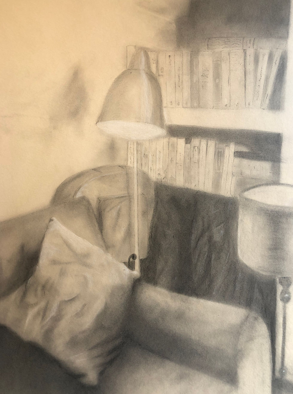
I had been intrigued by the clutter on the counter top in one of my prep drawing. I thought that a bit more focused attention might prove useful. This time I used liquid charcoal drawing with a brush and trying hard to get interesting marks. I really liked the outcome of this. It has, for me, a nice balance of loose fluid lines and sense of place. Now that I had completed the exercises for this section of the course, I turned my mind to the assignment piece.
Happy Scribbling
Comments