Here we are: the first milestone in this journey I’ve embarked on. Time really has flown, it feels like only yesterday I received my big folder wrapped in tissue.
So what to choose for this still life? This took some thought. I decided I needed to choose objects that represent me and all the things I love. Things that have shaped the person I am and have always remained important to me. So what are the most important things in my life? A good question, here is the list I came up with.
My parents - they’ve been around the longest and have to take some of the blame for way I’ve turned out.
Dawn - my partner in crime. Love her to bits and wouldn’t be the person I am today without her.
Music - having spent my entire life trying to be a musician, it’s now just a part of me. Even though I never really had to skills to make it my living, it’s good for the soul.
Art – I’ve always drawn, it’s something that keeps me creating and sane.
Star Wars – it’s been a source of fun and joy my entire life.
Tolkien – the stories of Middle Earth awoke my love of fantasy and reading at a young age.
So there we have it, I need to find objects that cover all of the above. After some more thought I settled on the following.

a. This is my R2-D2 phone, I’ve had it since I left home at 18. My parents bought it for me and has served as my main landline in many houses. He now lives on my desk keeping an eye on things for me. So that’s Star Wars covered, tick.
b. This beautiful antique hip flask is a prized possession. Bought for me by Dawn, it means a lot. It also have the added bonus of representing Whiskey, another thing I love, only the good stuff, mind, we’re not talking about Teachers with a splash of water!
c. This is my St Helens rugby shirt. St Helens is my home town club which I’ve supported my entire life. It reminds me of home and spending time with my Dad on the terraces.
d. Copic alcohol markers were one of the first art supplies I bought when I got back into drawing. They were always something I’d wanted to play around with and now I have an expensive addiction.
e. This is my Mum’s copy of the Hobbit, it’s the one she read to me and my brother when we were kids. It’s falling apart and unreadable these days, but I could bear to part with it.
f. This is the Associated Board of Music, rudiments and theory of music textbook. I think I nicked this off my Dad at some point. It’s been with me travelling from house to house since I was about 18
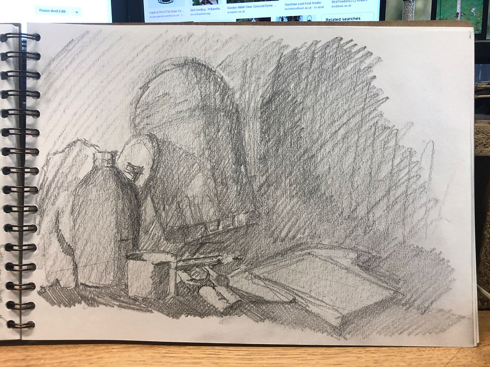
Now I had my props, it was time to have a good think and play around with the composition. I decided that I would stick with the lighting set up I’d used in previous exercises. This would allow me to use the things I’ve learned to my advantage. After a few attempts to lay out the items, I settled on an arrangement I liked. Now what angle would be best? Using my phone as a view finder, I moved around the arrangement of objects. I picked two angles that I thought might work and cracked open the sketchbook.
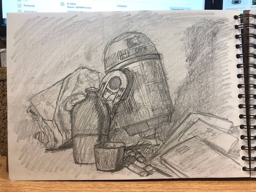
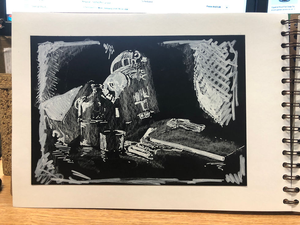
After a few pencil sketches, I thought it would be wise to have a go at the scene in a totally different way. I took a piece of black paper, and using white markers and chalk, I worked up a tone study only drawing the highlights. Although not a great drawing, it did the job of making me think about the scene in a different way, which I’m convinced helped when it came to the final piece.
After a few sketches, I settled on the more top down view. This just made more sense to me as an image. I had allowed a full weekend to produce the final drawing. This might sound like a lot of time but I knew from experience it would be tight. With this in mind, I decided to take advantage of technology to aid my progress. I used an app called Grid# to layout a simple grid pattern over the photograph I’d taken. This would allow me to transfer the basic outlines of the shapes to paper accurately and quickly and leave me more to concentrate on the drawing itself.
This is a technique I have used many times before and I find it very helpful in the early stages of a drawing. I have learnt from experience that knowing when to stop relying on the photograph is important. Slavishly copying the photographic reference has the tendency to produce less favourable results than drawing from life.
Next, I needed to decide on what medium and surface I would use for the drawing. Charcoal was my weapon of choice as it’s the medium I am most comfortable with. I find the ability to layer the drawing and push and pull the image around very satisfying. As I’ve previously mentioned, it’s not easy at present for me to work bigger than A2 due to space constraints. I had a look through my stock of A2 paper, settling for an off white, heavy weight cartridge paper. This was for a few reasons. Firstly, the slight toned paper would allow me to use white chalk to produce the brightest highlights. Secondly, it would make the transitions from deep shadow through the mid tones easier to achieve. In addition, it was heavy enough to be able to stand up to the abuse I would be giving it.
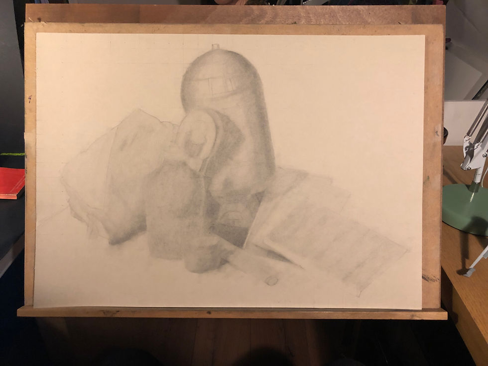
I laid out the grid using very light lines with a 2H pencil, copying the outline shapes from the gridded photograph. I was almost ready to start adding tone, but before I cracked out the charcoal, I tried to make a few decisions about what I want the finished piece to look like. I’d already come to the conclusion that I wouldn’t be going as tight and real as the drawing of the tea pot I’d done earlier. I wanted the image to have a focal point with sharp crisp details to contrast with other areas which would be more loosely rendered.
As I’d done with previous charcoal drawings, I began building up tones, ignoring fine details until I was happy with the balance of light and dark. This tonal work was begun with very soft vine charcoal, adding and subtracting value with a kneaded eraser. I then transitioned to harder grades as I got closer and closer to adding details. All the finer details were done with Conte charcoal pencils; these tools allow the sharpest points, the blackest blacks, and the most defined lines. The final stage was to add some white charcoal highlights to help increase the tonal range and help the image pop a bit more into three dimensions.

On reflection, I think this drawing has a touch of the Jekyll and Hydes. I’m happy with the drawing —it looks a lot like the picture I had in my head at the start. I think it’s more successful than other drawing I’ve done earlier in the course. But I can’t help but feel it’s a bit emotionally flat. Now could this be that I haven’t really engaged with the emotional value of the objects in front of me? Probably. Could it be that I’m subconsciously still not comfortable giving that much of me away? I’m no psychoanalyst but it seems a good hypotheses. Or could it be that while this drawing was being done, life had taken a tricky turn? I’ve had a lingering health problem that has taken up much of my mind, leaving me with little left for anything else. Undoubtably. It’s all of the above. Couple this with my inexperience of producing any other work than what I feel like drawing, usually people rather than household objects. Drawing to order, for want of a better word, just isn’t something I find natural. But in completing this section of the course, I feel like I’m on the right path.
I now think about what I’m drawing significantly more and hope that this discipline will prove fruitful over the coming assignments.
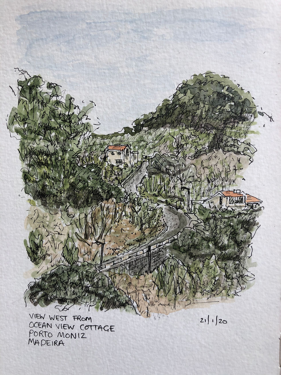
I’m writing this final blog while sat half way up a cliff on the island of Madeira. Health issues have been tested and found clear. My brain is slowly emptying of the stress of the last few months and I’m looking forward to the continuing adventures this course has to offer.
I’m off for a tall drink with an umbrella in it and some well earned down time.
Happy scribbling.
Good write up Ian and I already told you I liked the drawing , especially r2d2 . Loved the little sketch of the hillside , watercolour ?