OK so you may have noticed a bit of a gap in these log entries, here’s my amazing excuse. I’ve been knackered both physically and mentally, coupled with an ongoing health issue. Oh and it’s been Christmas and all that joyousness. When I began this course, I spent an hour or so looking at the work that needed to be done. I took each exercise and it’s accompanying written work and created a schedule. Planning out how much time I could allow myself for each exercise and still meet my first deadline. This has been totally and utterly blown out of the water because of the mentioned issues. That being said I don’t feel it was a wasted exercise, I have been able to reflect on how I structured the work out. When to push on with practical tasks giving me blocks of work to look at and think about. Allowing my creativity to lead what I do, if the drawing juices are flowing don’t stop them. Also I’ve tried to learn when to stop and allow myself time to not study and relax. Saying that I can assure you that the wheels haven’t come off completely. I’ve been continuing with the practical exercises and drawing as much and as often as time allows. Hopefully now the madness of work and all the jollity is out of the way a more ‘normal’ structured approach can be resumed (maybe).
Another week passed and I ticked another exercise off the list. Well done me. The week’s task was about texture and representing it in various ways. After the previous week’s emotional rollercoaster, I found this task a lot easier to get down too. I generally draw something every day, so for the first few days of the week I filled a couple of pages with relatively quick pencil drawings of things I saw around me, at home and in the office.
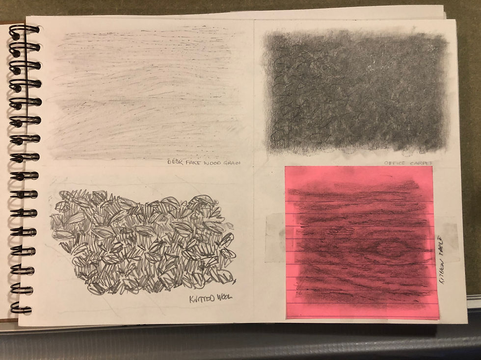
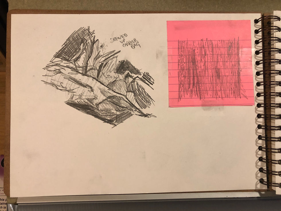
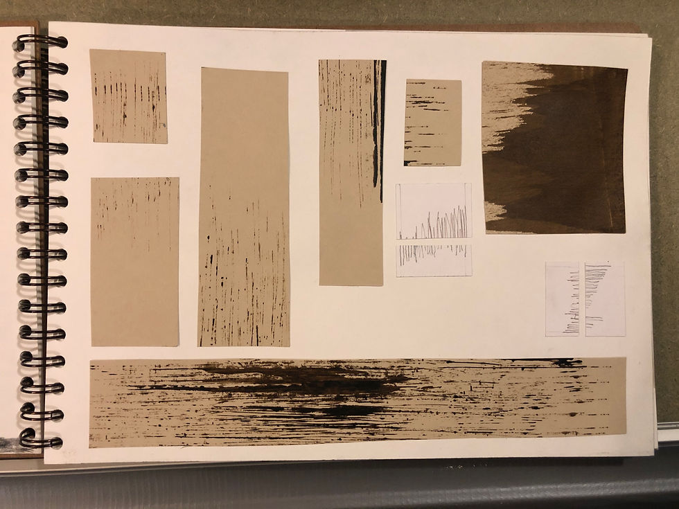
I particularly enjoyed the OFFICE CARPET (Top right image 1) drawing. This was done from life while on lunch break; I got a few odd looks as I lay on the floor drawing away. I used an 8B pencil, layering then blending, layering then blending. Trying to build up varieties of tone, rather than just smashing a load of graphite down and having nowhere to go. I finished by adding some light sweeping gesture with my eraser. SCREWED UP CARRIER BAG (Top left image 2) is not so successful, in my opinion; I’ve failed here to capture any of the three dimensionality. I blame this on not looking at the reference hard enough, and trying to work too fast. On the very rare occasion I don’t have a sketch book with me, I’m more than happy to grab whatever is lying around. As you can see I’ve tackled a couple of wood grains on the most horrifically lurid post it notes I could find.
As part of my research, I have been reading other students blogs who have tackled this course before. This has been of great help, it’s shown me how others have gone about keeping this log. But it’s also been a great source of inspiration, in one such blog I saw that someone had used bubble wrap as one of the textures. Looking at their interpretation (apologies, I can’t remember or find again the person I’m referencing. Take more notes, you fool!) I had to give it a try myself.
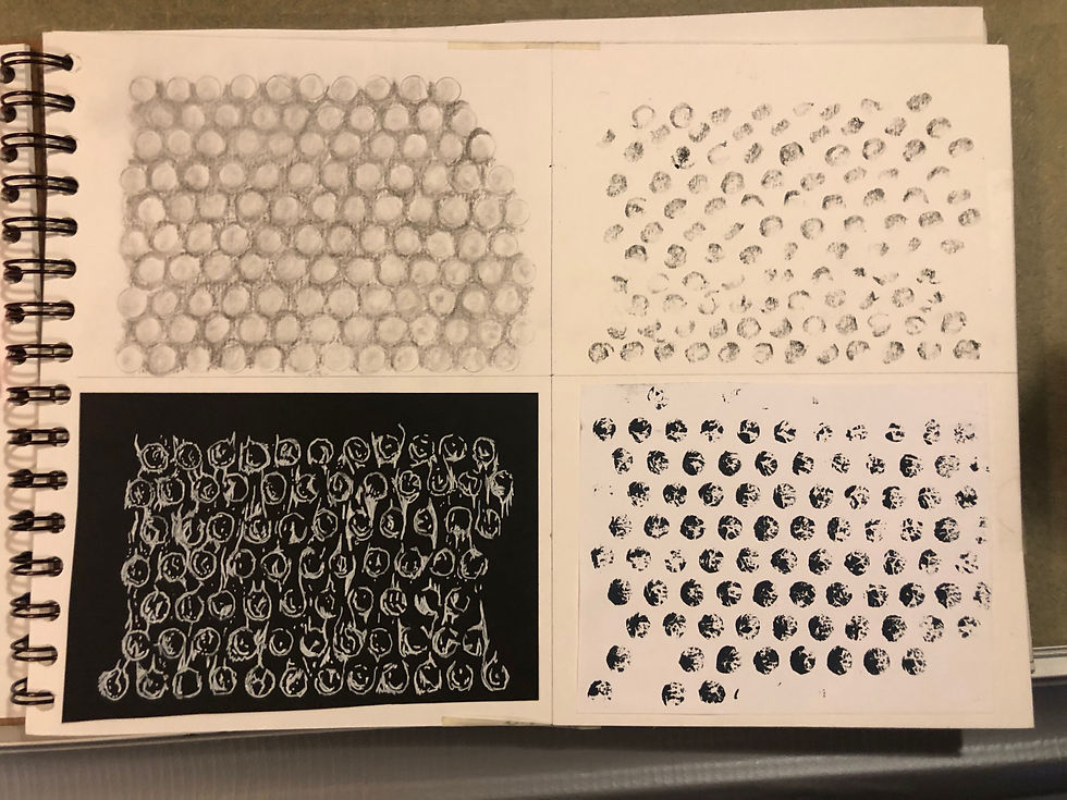
I set about this in a similar way to the previous exercise, dividing my page into 4 and changing medium in every panel. Top left you can see my attempt in charcoal. I have recently become a convert to Nitram charcoal and it’s been a revelation to me. The sticks can be sharpened to a super fine point and having them graded in line with standard pencil grades made the transition really easy. I slowly built up the tones using a kneaded eraser to remove material for highlights. Although this is a medium I am relatively comfortable with, I don’t think this is my best drawing. Everything feels a bit flat and uniform, the balance of light and shade is far too narrow, leaving it quite uninteresting.
While thinking about this, I next tried working on black paper with a white ink pen (bottom left). I placed my piece of bubble wrap on the black paper and thought about how to render something. Knowing that the medium I had chosen would make half tones impossible, I concentrated just on the specular highlights. I aimed in this panel to get the feeling of the texture, rather than a realistic representation, the sensation of the little pocket of air in my fingers. I was moderately satisfied with this experiment and enjoyed the challenge of working the wrong way round. Thinking about drawing the light rather than drawing the absence of light.
The next panel I filled was done with fountain pen ink (bottom right). I loaded a brush with ink and applied it directly to the bubble wrap itself, then using this to print the image onto the paper. This methodology came to me while reading about frottage (more on that later). If taking an image from a textured surface by rubbing produces one type of image, what happens if you reverse the process? The crackled effect that this produced is really satisfying for me and I do wonder what other things would look like if treated in the same way. This will definitely warrant further experimentation.
Reacting to the previous panel, I thought about how I could achieve a similar result with more traditional materials (top right). I settled on a cylindrical oil pastel with a diameter similar to the bubbles. Using a sharpening block and a sharp knife, I shaped the end of the pastel so that it had a slightly concave end. This allowed me to roll the pastel round its edge to get the circular shape, varying the pressure and direction ensured a variety of marks. The centre part of the pastel had been roughed up so applying firm straight-down pressure and a little twist gave me another texture. Although interesting it doesn’t really feel like bubble wrap but the process was no less valuable.
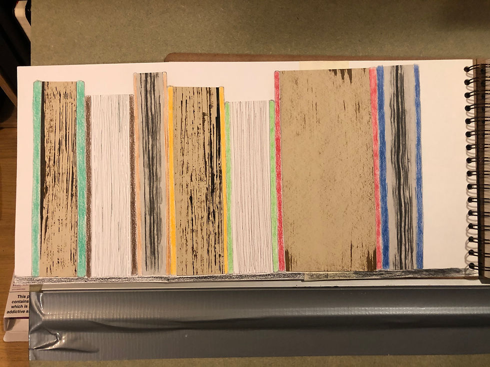
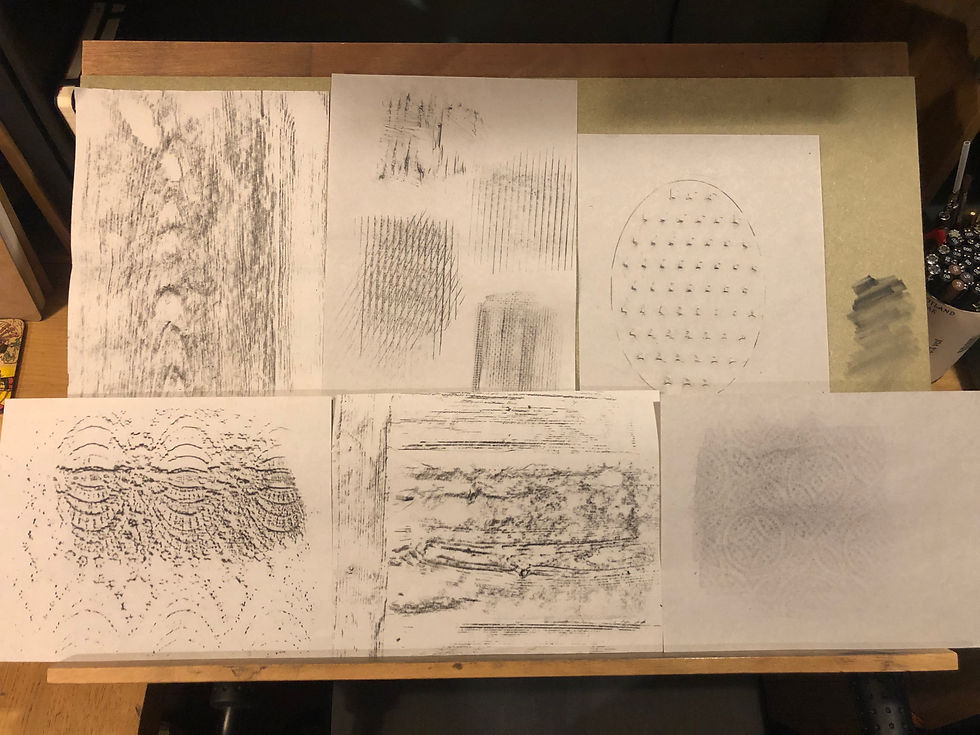
The final texture I looked at was the edge of a large scrap book I had lying around in my studio. I have had it kicking around for ages, and I sometimes like to use the pages for charcoal pencil drawing. The extremely course paper and the nice sandy colour make for a great surface for value studies. Being quite cheap rough textured paper, it makes the edges of the pages an interesting thing to look at. My first attempt to render them was using frottage. I took some thin newsprint paper and a big block of charcoal and took an impression (Book 3-Orange & 7-Blue). Next I poured some ink into a tin foil take away container. Using the edge of a thin piece of laminated card I dragged ink it in lines to represent the pages (Book 1-Turquoise & 4-Yellow). This technique was somewhat unruly, ink would pool together and making controlled marks difficult. That being said, I did like the result. The erratic nature of the marks evoke the same vibe as the ratty scrap book paper ends. Sticking with the same ink and bit of card, I started using the edge horizontally rather than vertically (Book 6-Red). This gave more a grainy texture once the majority of the ink had been wiped off. It looks more like a fine expensive hard back than a scrap book but, none the less, a good texture. Finally, I took a fine tipped pen and tried to get a representation using line (Book 2-Brown & 5-Green). These are the least interesting of the bunch, they don’t do anything for me. Once I had all of my experiments done I had planned to lay them out in my sketchbook, one after another like the previous exercises. But an idea struck me: as I was representing the edge of a book, why not make a book shelf? So I did. The simple act of colouring in a few book covers made me smile and made the page so much more pleasing to me.
These are some of the off cuts from the exercise, I thought it a shame to waste them. Some of the ink marks are really interesting to look at and will be there in the future as reference.
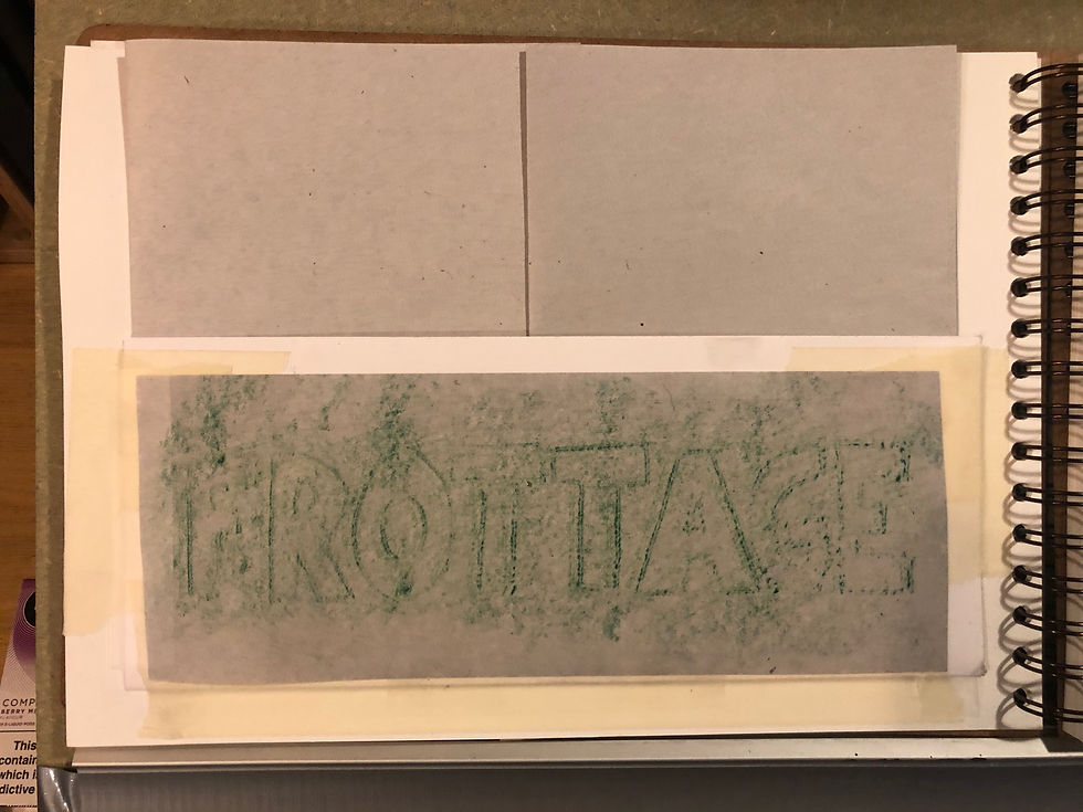
The exercise then asked me to explore frottage, a technique I have never used beyond the odd grave stone rubbing as a primary school kid. The first thing I did was to experiment with which medium and paper to use. I tried charcoal of various types, pencils of all grades, finally settling on a black woodless coloured pencil stick. This gave me the most satisfying results and was the easiest to control. The paper I settled on was sheets of “butchers” paper, similar to newsprint, its thinness and slightly rough texture made the impression stand out best. Unfortunately, I am unable to show you the resulting test pages as I managed to spill coffee all over and they were ruined. But here are the results of my experiments:
Having never really considered the technique before, I am now happy to have it in my tool box. It may not be the first tool I reach for but I’m sure there will be occasions when it’s the perfect fit for a particular task. You can’t help but be inspired by looking at some the work of Max Ernst. Working in such a surreal way combining textures to create abstracted images. Building up layers of texture to produce some fascinating marks.
In other news......
At the end of November I had a chance to see Luke Jerram’s instillation Gaia. Gaia is a seven metre diameter sculpture of the planet Earth. It utilises high resolution NASA imagery to give the viewer the opportunity to see the planet from an off world angle. According to the artist it was created to produce a sense of the Overview Effect often felt by astronauts when viewing the world from space.
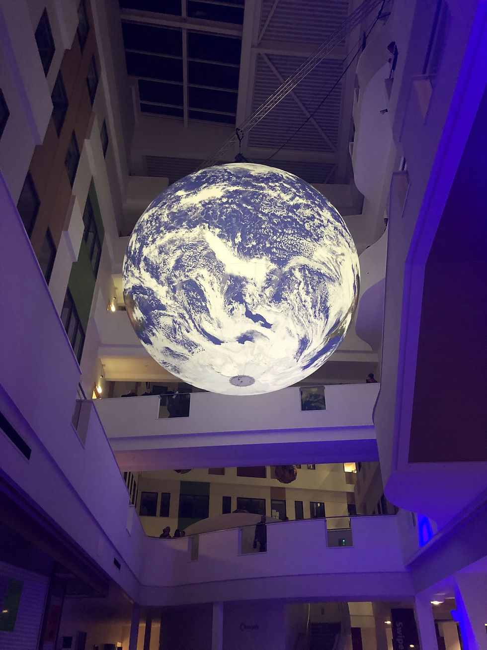
The instillation I saw was displayed in the main lobby of Barnsley College meaning it was possible to view the work from various angles and heights. The way the viewing route was planned meant you entered from the ground floor and were immediately struck by this enormous glowing blue orb slowly rotating in thin air. This for me was the best viewing angle as it allowed you to take the whole in rather than the later close up viewing spots. These close up looks just made me feel like an earth smashing giant in some bad super hero movie. I have to say it didn’t engender the desired emotions in me, but it was an impressive thing, overall a worthwhile visit. But I left with more questions about the reasons behind it and the technical aspects of its creation rather than a “profound understanding of the interconnectivity of life“.


Ok that’s all for today, I’m off for a lie down.
Happy scribbling
Comments