
This assignment was designed to allow us, as artists, to demonstrate both the observational and the technical skills we have been focusing on over the previous two sections of the course. We were asked to produce a drawing that demonstrated an understanding of the following things.
The use of colour in drawing
The selection of appropriate medium
Composition and context
Mark-making and contrast of line and tone
Accurate and expressive depiction of form
Experimentation with idea, material and method
The drawing itself could be a still life or an interior scene, or a combination of both.
Having spent most of my time over the last section of the course drawing one or other of these things, I felt a little dry of ideas. I resolved to do some research and look at how some other artists had tackled similar subjects. Here are a few examples that I took direct influence from for my own piece.
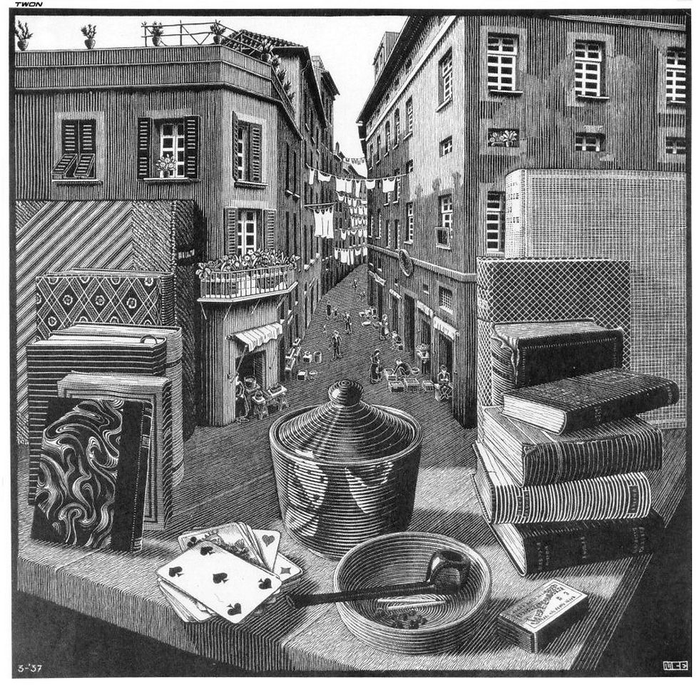
M C Escher - Still life and street 1937
This unusual woodcut print was one of Escher first works to depict an impossible reality. I find this image very intriguing, I love the how the playful use of perspective holds your hand through the image. You’re led from one part to the next by clever use of line, with each section giving you a wealth of detail to get lost in. I particularly like the way the playing cards are shown in reflection, distorted and warped, but none the less totally believable.
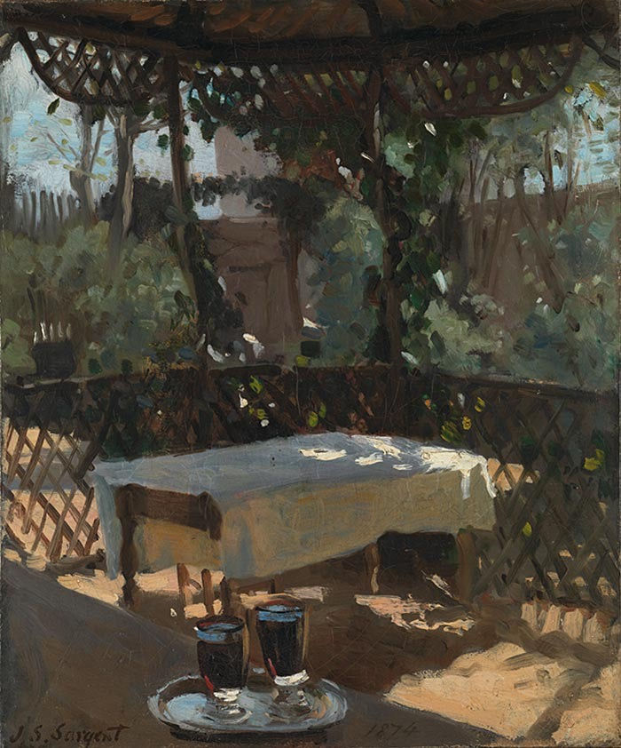
John Singer Sargent - Wineglasses 1874
This painting was produced by Sargent when he was 19 and shows the influence of the Impressionist movement. The image is such a sophisticated composition; the way in which each object in the scene is placed gives a wonderful sense of informality. The treatment of light is just incredible; you can feel the heat of the day radiating from the canvas.

Norman Ackroyd - At Thirsk Hall 3.30am 2017
This etching for me is one of the most arresting images of a wine glass I have ever seen. The erratic lines hint at the amount of wine that has been consumed, you feel a little drunk just looking at it. Your eyes dart around the image desperately trying to settle, desperate to stop the room from spinning, in my case without success. It was this Ackroyd that was the main jumping off point for me and my piece.
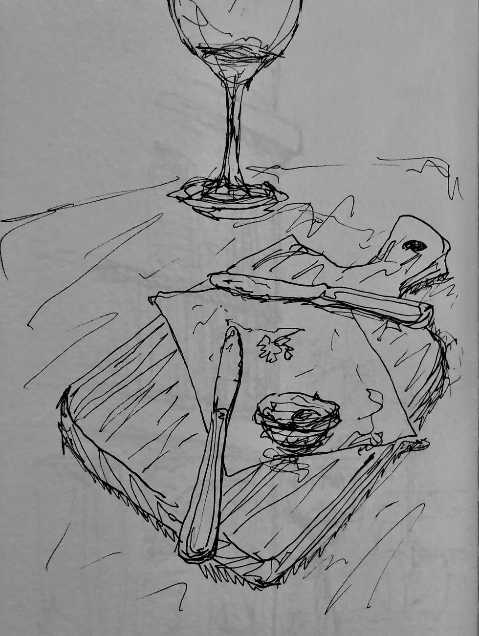
We had just ordered lunch sat in the sun in Porto Moniz on the north coast of Madeira. We had successfully polished off an appetiser of fresh bread and tapenade. While waiting for the next course to arrive, I did this sketch in pen. After looking at the Ackroyd, I was reminded of it and thought it might be an interesting idea to recreate the scene and use it for this assignment.
I took items from our kitchen and arranged them in a similar way to the initial sketch. I did a number of thumbnail sketches trying to work out how I wanted to compose the scene.

Settling finally on this as my composition, I was thinking about the simple geometric shapes and how best to arrange them to lead the eye through the image. I liked the repeated circles that run through the centre of the image. The rim of the glass leads you to the surface of the wine, which in turn is followed by the base of the glass, and finally the small bowl. The chopping board and the knives, along with the edges of the table each cut through the vertical symmetry, framing the scene and adding some contrast.
I produced a number of ink drawings of this composition but never really found myself totally satisfied. Each image had something I liked but never felt resolved in one way or another. Going back to the assignment brief, I looked at the six required points. I was way off and would need to think again: what was I trying to achieve with these drawings? What did they say? More importantly what did I want them to say?
While attending an online study practice session, I had the chance to speak to some fellow students and took onboard some of their thoughts. One thing that was mentioned was that the images, although on their own might feel unresolved, displayed as one large work might offer an opportunity to say something about my practice, my choices of mark and how the passage of time can affect the approach of an image. With this in mind, I looked at my work anew: not as a series of unresolved images but as a study into my own thoughts about what makes a successful drawing. It allowed me to be much braver; it led me to produce more experimental, expressive marks.
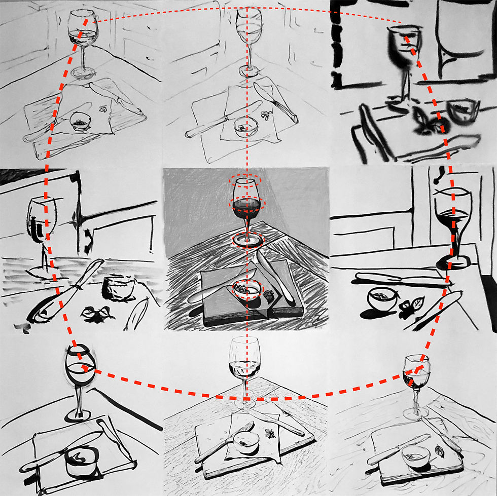
I had now come to the point where I would need to combine a month’s worth of drawing into one coherent piece of work. As I had only produced one colour image that I was satisfied with, I made the decision to make this the centre point of the work. This would give focus to the piece, drawing the eye first, but then allowing the viewer to explore the diverse monochrome surrounding images. As each drawing has differences in composition, I used these differences to balance the whole. The wine glasses form a circular motif which echoes my earlier compositional device with the circles. I tried to make sure that no matter which way you travelled round the image you could find a flow.
I’m really happy with the way this work has come out, not only have I created something I find visual appealing, but I feel it has allowed me to develop as an artist. I have used colour in a non-representational manner for the first time. Selecting hues to represent feeling, rather than what I could see with my eyes. I have used mediums that I felt comfortable with, but not always in control of, allowing expressiveness and excitement. I varied my mark making from image to image in an attempt to demonstrate the passage of time. My draftsmanship, although not perfect, does accurately represent what I was attempting to depict, and the varied nature of the sections demonstrates a willingness to experiment with idea, material and method.
This final piece is without doubt the biggest work I have ever created and as such it’s always going be difficult to get across digitally what it’s really like to stand in front of. I have tried when documenting it to provide both close up sections and more candid shots that hopefully help demonstrate the scale. For more a more detailed view of the work, please CLICK HERE, where each section can be clicked on for a zoomed in view.
Happy scribbling
Comments